HTTP://MARISOLIZAGUIRRE.COM
If you noticed, the Blog got a fresh make-over a few weeks ago. With the blog's new look I remembered it has been almost a year ago when I decided to completely re-design my website and provide it with a very much needed facelift. It was meant to be a weekend project that essentially turned into a month long full of late night creativity. But my goal was accomplished. I am very proud of my website on so many levels. Thus, I wanted to share with you my insight on creating my virtual space...
Let me preface - I am not a graphic designer. I do not know too much HTML. I do not know technical design aspects. What I do know, though, is what I like.
When I began the re-design process, I wanted the entire site to feel inviting, welcoming, cozy and be a reflection of who I am - my personality. I wanted you to go online and gather a sense of who I am as a photographer and what type of images I enjoy creating. I also wanted it to be fully informational.
Did I achieve my goal? I like to think so but, friends, I'll let you be the judge of that.
Anyway, I wanted to explain the components of my website, why I chose to do things a certain way and, hopefully, encourage you to share the site with all your family and friends ;)
In terms of software, remember I do not know HTML. Okay, I lie. Sorry! I
do know a little about computers, html and all that geeky stuff. But, but it is definitely not my forte. So a few years ago when I was looking for software to use to create my site I came across a program called
SHOWIT. When I read up on it and after downloading the program, I realized it was exactly what I had always dreamt of! Personally, I think it is the best and its purposes serve my need plus creativity. The possibilities are truly endless.
Word of advice, it does cost a pretty penny but, like I just said, it's pretty :) It is definitely a wise investment if you like to create your own site and have lots of fun and freedom doing so. Another plus, it comes with it's own hosting - made my job so much easier. Total perk :)
Okay, so let's move forward with my website...
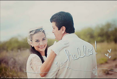
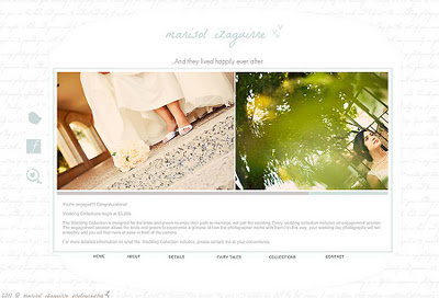
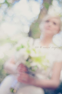
On my landing page, also commonly referred to a splash page, I decided to use recent favorites. I noticed I change the image every 4 or 5 months... at least that was the pattern since last year. The landing page is the very first page my clients see when they type in the url (http://marisolizaguirre.com). I created it to appear and then automatically disappear while introducing the home page. <-- Took me a while!
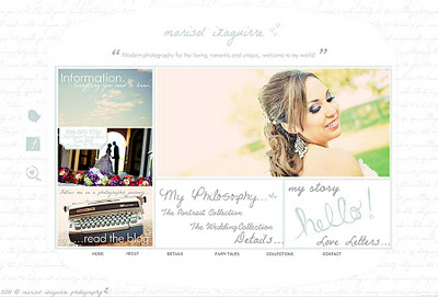
The landing page (above) automatically takes you into the home page of the site. No need to click. I sketched this out on a piece of paper and from here I built my website. I wanted the look to be a mixture of classy, romantic, feminine and whimsical. It has the same color scheme that my office, blog, packaging and everything else I use for my photography uses. When you visit the website, my virtual home, I wanted it to feel as if you were coming in to my office and meeting with me in person. I wanted it to be ME :)
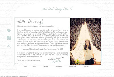
For the About Me section, I wanted to write to you - the reader. I don't favor writing in 3rd person... I am talking to you and I want you to know it. ::wink::
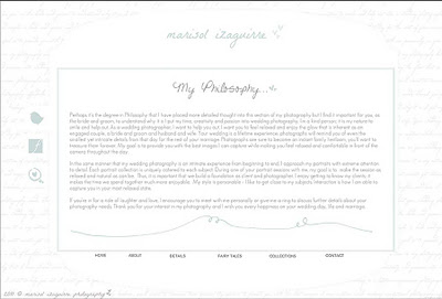
I also have a page where I discuss the Philosophy of my Photography. Although I am a philosopher, I don't go into my world views and/or existential angst discussions... ha! Instead, I want my potential clients to know what my photography is about, my style, and why it is so.
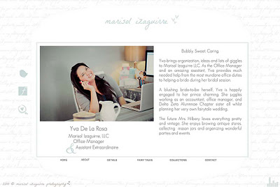
Yva, my lovely assistant made her debut on the website a few weeks ago...
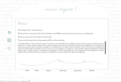
I also decided to throw in a page about my policies... very important. It's good to have your target audience informed.
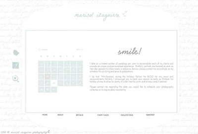
The calendar on the website is highly important for me. I thought it was a great component to add to the website. That way you are aware of my availability. This is one of my favorite pages... I think it's cool :)
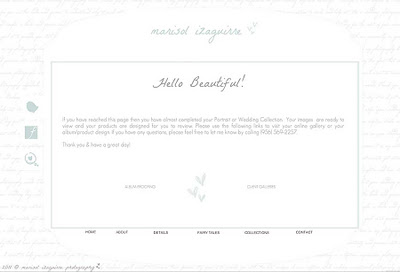
I also have a Client's section where you are able to view your wedding album design and approve it or note any changes we need to make. You can also link out to the proofing galleries where the actual images are stored for online viewing... more on this towards the end.
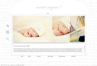
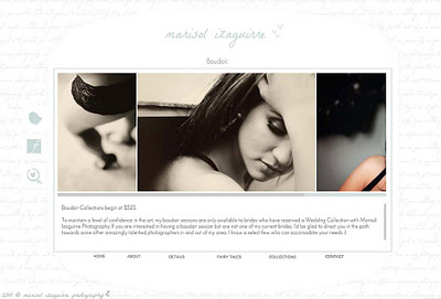
As for the Gallery portion of the website, I opted of having a specific gallery for each category of photographs I capture...
Weddings. {I included Bridal and Wedding Images here.}
Life. {I included Newborns, Children, Families and Portraits here.}
Boudoir. {Solely boudoir.}
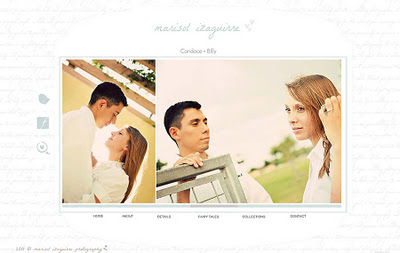
Then I also included a few featured collections... What I mean by that was that I thought it was imperative that my potential clients see what an entire collection looks like. What do I mean? Websites usually hold snippets of sessions and weddings for very obvious and practical reasons. But I wanted my future brides to catch a glimpse of a collection in its entirety... Engagement Session, Bridal Session and the Wedding.
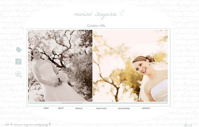
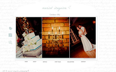
Here's Candace and Billy... one of the featured collections. The gallery begins with some of their engagement photos...
... and some of Candace's bridal photos....
... and, of course, wedding day images.
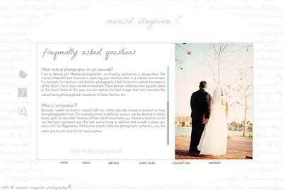
There is also a F.A.Q.'s section on the website. I came up with these questions on my own and I consider this page a work in progress. I have more questions and answers I want to include. If you have any suggestions, please feel free to share! I'd love your input :)
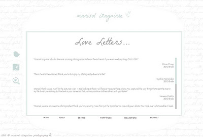
The Love Letters section is basically just a page with testimonials... nice comments from my past and current clients. Their form of appreciation... an appreciation I am forever thankful for.
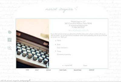
The contact page has all the necessary information for you to get a hold of me :) There is also a contact form you can use for quicker messaging.
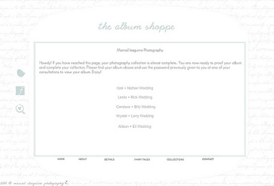
Taking a few steps back... the Album Shoppe has all the current Wedding Album Designs for my clients to review as previously mentioned.
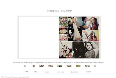
Here's an example of a wedding book proofing gallery...
As for music, I searched for weeks for a perfect song I could include. While some photographers do not like music on their websites, understandably so, I like having a tune to accompany the viewing experience. But, you can easily turn the music off by clicking on the speaker sounds at the bottom right hand corner. I also set the volume really low so that you're not frightened if you forget you have your speakers on... just looking out for ya'!
Here's the tricky but extremely important part... having music on your website can step on toes... copyright toes, that is. No matter how much I wanted to include music from some of my favorite artists I opted against it for the mere and simple fact that I did not have a license to use their music. Thankfully, however, there are options - plenty.
I used
Triple Scoop Music which has a great selection of music for photographers and other creative individuals to license and properly use by purchasing a license. Here, I found the perfect song to accompany the personality of my website, my brand, my photography and me. I chose a beautiful song called
God Is by Faith Rivera. I immediately fell in love with the tune the moment I previewed it. It tugged at my heart on so many levels. In my opinion, it reflected my photography and myself in its beautifully written lyrics.
Where I am GOD IS
Where I stand GOD IS standing strong
Where I breathe GOD IS breathing life
In & out & through me…as me
Where I sing GOD IS
Where I dance Joy lifts my feet
Where I live Beauty's flowing free
In & out & through me…as me
Where I doubt GOD IS the faith in me
Where I cry GOD IS the comfort there
Where I seek GOD IS the answer
Here, now, forever & ever & ever…
Where I speak Truth is
Where I work Love is my career
Where I play GOD IS playing boldly
In & out & through me…as me
Where I am
Where I stand
Where I play
Where I work & breathe & move & be
Where I sing
Where I dance
Wherever I go
Where I pray & take & give & live
GOD IS…GOD IS…GOD IS…GOD IS
God Is by Faith Rivera
I don't have a studio and, instead, photograph out in the world - where I am happiest. I absolutely love my job and my most important aspect is photographing humanity in its natural element - the world. When I began this journey of building a business, I knew I wanted to photograph the world; it's beautiful and God created such a beautiful place, studio if you will, for me to use. Why would I not want to be out and about?! Thus, when I heard this song it was perfect for me and my brand. This song defines me who I am as a person, not just solely as a photographer. Plus, how could I go wrong with... "Where I work Love is my career..."
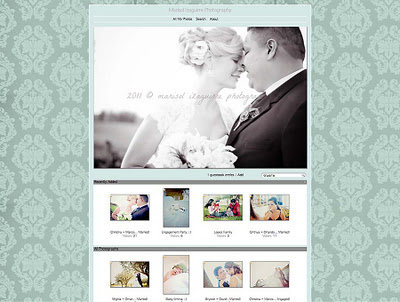
And, while the following is not on the SHOWIT platform, I figured I'd share with you my Online Proofing Gallery that I use for my client's images. I use
Zenfolio and I am quite happy with it. It is simple and basic but gets the job done. This is what the gallery looks like... still keeping with the color scheme I am literally obsessed with. It, too, matches my office :) I have been using both Showit and Zenfolio for two years going on three... I think I am definitely a fan.
There you have it... the anatomy of my website. I worked very hard to create it. I hope that is serves its purpose fully. What do you think?
http://marisolizaguirre.com
**If you're a photographer and need help with your Showit website, I'd be happy to help or at least chat with you :)
Happy Sunday!